16 Installations
YEAR: 1997
CATALOG NUMBER: 118
PROVENANCE
Collection of the artist
EXHIBITIONS
Museum van Hedendaagse Kunst Antwerpen, Antwerp
16 Installaties, Muhka, 17 Apr 1998 — 23 Aug 1998
CONCEPT AND DESCRIPTION OF THE INSTALLATION
Sixteen different installations will be displayed in the museum. Virtually all of them are being exhibited for the first time. Some of them will be delivered from New York in their finished form, others will be made in Antwerp. Each installation is to be arranged in a separate space, in its own room. Therefore, dividing partitions must be erected (diagram attached). The doorways through these walls are always the same size: 1.3 meters. The walls are 2.5 meters high (with the exception of Installation No. 14). The upper parts of the walls and the ceiling are white.
List of Installations
Until this time, I had done primarily large installations, and sometimes very large ones, like We Live Here. In all these cases, the main actor was the aura, the air, the atmosphere of the space that I carefully conceived and prepared with the help of the color of the walls and floor, the construction of the place itself, and special lighting. The role of the objects, despite the fact that in some installations there was a true abundance of things, was subordinate in such spaces, even insignificant – the main thing, I repeat, belonged to the effect of the specially arranged and energetic charge of the ‘medium’: such, it seems to me, was the nature of a Russian-Soviet installation. This time I wanted to try my efforts at making an installation, or more accurately, a group of installations, of the ‘Western’ type, where what dominates as the artistic image is not the space but rather the object, and the space itself, the surrounding medium, is just a place where this thing is located: these spaces are neutral, well illuminated and serve as an ordinary white box, a case for displaying the object that has been placed in it.
Therefore, I thought up these ‘objects’ ahead of time and planned just such a white box for each of them, white empty space where I would house them. I sent the plan for arranging the partitions and space in the museum was constructed as I had planned.
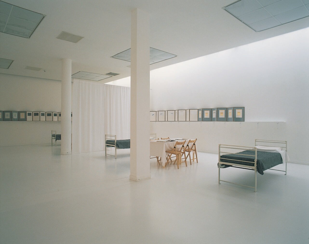
When I arrived to set up the exhibit, I saw that the objects that I had invented and brought with me could not be placed in the rooms allocated to them, because these rooms didn’t have … a floor! That is, there was a firm and stable floor, but visually and psychologically it didn’t exist, since it had been painted white by the architect just like the ceiling and walls! I somehow had missed this effect when I was in the museum previously for the first time – and this cosmic effect, as I came to call it, manifested itself immediately, as soon as objects were placed on this floor. The white floor destroyed any sense of weight, stability, and my vestibular apparatus, (and not only mine) began to ‘mutter nonsense.’ Mentally I began to lose my sense of up and down, and finally, after even just a short while in such a space, I began to approach the verge of insanity, losing the ground under my feet.
Along with this, I saw that my hopes for making and erecting in the separate rooms objects that were independent of one another were also experiencing defeat. The viewer, passing from hall to hall and not finding connections, began to get bored and the entire exhibit rather quickly turned into an ordinary, recognizable exhibition of any Western gallery, the kind that everyone has been sick of for a long time already.
I urgently had to crawl out of the pit that had opened up here, think of something that would immediately ‘conceal’ both awful, seemingly catastrophic elements: the ‘white’ floor and the divided objects. Or, more precisely: I had to justify the ‘white’ floor (it was too late to paint it or cover it with something) and somehow unite the objects in each room (and there were 16 in all!) via some common idea.
The idea for ‘salvation’ came to me immediately (as a rule, this is true whenever I start to fear terribly that I have fallen into a situation with no escape): the entire museum had to be transformed, or at least this part of it housing the 16 installations – into an insane asylum, that is, impart a logical interpretation to that insane effect that we just spoke about above. To achieve this, only a few things had to be done: first, in all the doorways we had to hang white curtains that would reach the floor, use them to partition off the large rooms; a desk and chair had to be placed in each room covered with the same kind of white material where ostensibly a medical orderly sits with the medical inventory, and on the wall of each room we hung a board with the text of the patient who was apparently always in this clinic. These texts would comment on each object and connect the 16 rooms and objects via a unified logic in the consciousness of such a patient.
As a result of all of this it was impossible to create a normal Western installation: again what emerged was a single aura, a single color of everything – this time, it was insanely white, and again a ‘personage’ unexpectedly emerged.
It remains only to be said that in terms of its type, these installations are similar to Ten Characters done in 1988 in New York: it also represents a single, generalizing idea-image that in turn breaks down into a number of separate installations, each of which, just like the characters of the New York exhibit, can exist independently.
Images
Literature


